Clique Advisor
B2B advisor management platform for accountants
Learning to manage your finances is always a tricky task. For individuals who haven't had the chance to learn much about personal finance it can be daunting to try and pick it up as you get older. Clique Advisor helps individuals build a personal finance roadmap based on advice from professionals and tailored to their specific financial goals. My role encompassed design, research, product and marketing. I worked alongside 1 UX Designer, 3 Engineers and the business founder.
My Impact
Designed web & mobile app experience from the ground up, focusing on reducing cognitive load in areas with large amounts of data & information. My work resulted in: - 39% increase in weekly active users from previous quarter - 24% increase in registrations from previous quarter
Designed web & mobile app experience from the ground up, focusing on reducing cognitive load in areas with large amounts of data & information. My work resulted in: - 39% increase in weekly active users from previous quarter - 24% increase in registrations from previous quarter
The Brief
Clique reached out to me looking for help in understanding why users were struggling to find the advice & information that was being tailored specifically for them. They had received many complaints around the complexity and overall lack of intuitive navigation on the platform and wanted to re-design from the ground up to address these concerns before committing too heavily into their MVP. These challenges were exacerbated by the lack of responsive behavior and letting accessibility fall to the wayside while building out their initial concept.
Clique reached out to me looking for help in understanding why users were struggling to find the advice & information that was being tailored specifically for them. They had received many complaints around the complexity and overall lack of intuitive navigation on the platform and wanted to re-design from the ground up to address these concerns before committing too heavily into their MVP. These challenges were exacerbated by the lack of responsive behavior and letting accessibility fall to the wayside while building out their initial concept.
Research & Interviews
The project began with a series of calls involving the project owner & development team to understand the current state of Clique Advisor. A critical insight was that the team's design decisions were driven by personal preferences, rather than user needs, resulting in conflicting decisions. As the first designer collaborating with the team, I conducted a design and usability audit of Clique Advisor. I then spoke with active users to validate our assumptions and identify areas for improvement. Opting for remote video interviews to accommodate the diverse locations of Clique users across Canada, I led nine interviews with users varying in financial literacy. This helped us uncover their frustrations, pain points, and favorite aspects of Clique. These participants later joined follow-up interviews to assess the effectiveness of our changes. Below are some key insights gleaned from user conversations:
The project began with a series of calls involving the project owner & development team to understand the current state of Clique Advisor. A critical insight was that the team's design decisions were driven by personal preferences, rather than user needs, resulting in conflicting decisions. As the first designer collaborating with the team, I conducted a design and usability audit of Clique Advisor. I then spoke with active users to validate our assumptions and identify areas for improvement. Opting for remote video interviews to accommodate the diverse locations of Clique users across Canada, I led nine interviews with users varying in financial literacy. This helped us uncover their frustrations, pain points, and favorite aspects of Clique. These participants later joined follow-up interviews to assess the effectiveness of our changes. Below are some key insights gleaned from user conversations:
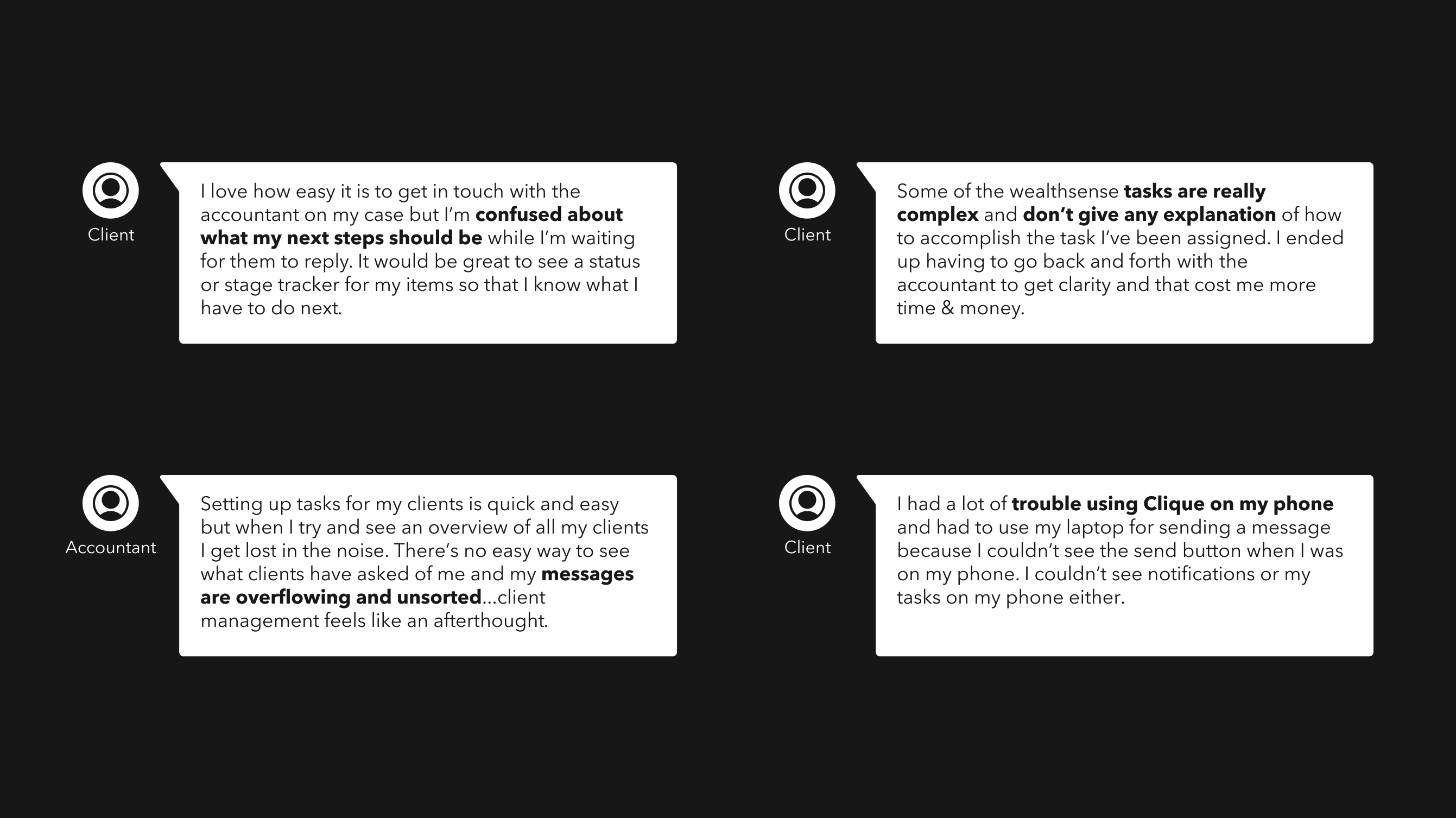
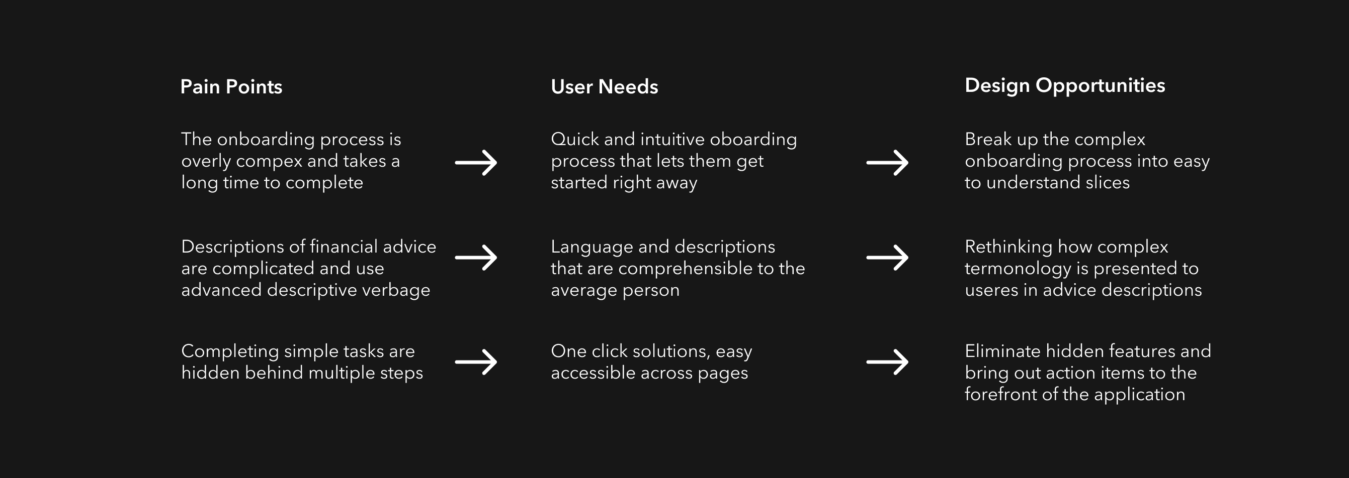
From these interviews I found that our users shared a few key problems that lined up with the issues I'd heard from speaking with the product team. Clarity of information was our first major challenge. I heard from multiple users that the presented information was too complex and used terminology outside of the average persons financial vocabulary. This advice was also being presented in large paragraphs that made it challenging to pull tasks & specific goals out of it. Onboarding new users was another frequent complaint. It took between 5-20 minutes and it failed to provide a clear picture of the users goals even after completion. Contributing to both of these challenges was the navigation & application structure. Every Clique user, both accountants and individuals, were unsure of how to complete simple objectives such as changing the status of a task. This was due to those interactions being buried or hidden within unnecessary navigation structures or settings panels.
From these interviews I found that our users shared a few key problems that lined up with the issues I'd heard from speaking with the product team. Clarity of information was our first major challenge. I heard from multiple users that the presented information was too complex and used terminology outside of the average persons financial vocabulary. This advice was also being presented in large paragraphs that made it challenging to pull tasks & specific goals out of it. Onboarding new users was another frequent complaint. It took between 5-20 minutes and it failed to provide a clear picture of the users goals even after completion. Contributing to both of these challenges was the navigation & application structure. Every Clique user, both accountants and individuals, were unsure of how to complete simple objectives such as changing the status of a task. This was due to those interactions being buried or hidden within unnecessary navigation structures or settings panels.
Context of Use
Alongside the general feedback. I wanted to learn how and where people are using Clique. The context of use would help inform the use cases that I could tackle first and give us more clarity around the situations that people are in when they're thinking about personal finance. I found that the interviewees fell into two primary types of use patterns. 1. People with more personal finance experience, who kept budgets or were frequently checking their accounts strongly preferred to use laptops or desktop computers with space to have multiple tabs & items open at once. 2. Younger users and people with less financial experience often relied entirely on their mobile devices for checking banking, sending money and managing their personal finances. These two primary groups showed the importance of having an application that was not only responsive but built with mobile behaviors in mind. One of the clients primary goals was to expand into younger demographics and mobile is a strong contributor for growth in that area.
Alongside the general feedback. I wanted to learn how and where people are using Clique. The context of use would help inform the use cases that I could tackle first and give us more clarity around the situations that people are in when they're thinking about personal finance. I found that the interviewees fell into two primary types of use patterns. 1. People with more personal finance experience, who kept budgets or were frequently checking their accounts strongly preferred to use laptops or desktop computers with space to have multiple tabs & items open at once. 2. Younger users and people with less financial experience often relied entirely on their mobile devices for checking banking, sending money and managing their personal finances. These two primary groups showed the importance of having an application that was not only responsive but built with mobile behaviors in mind. One of the clients primary goals was to expand into younger demographics and mobile is a strong contributor for growth in that area.
Wireframes
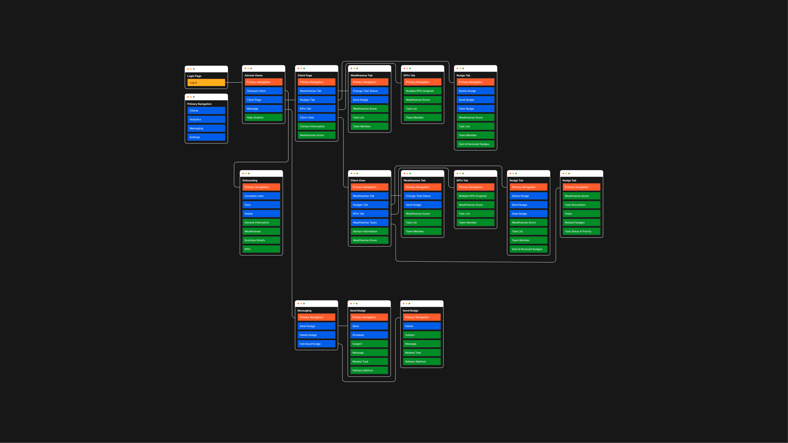
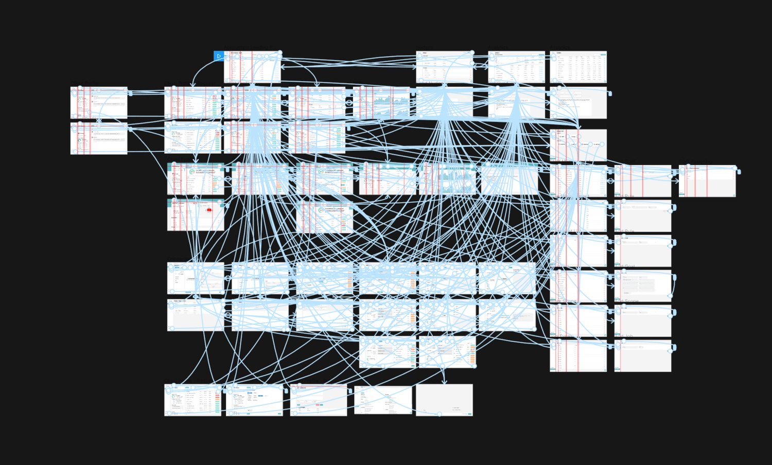
I built out rough wireframes to get a better understanding of the content on each page and the feature set that was feasible for the MVP. I reviewed all these features with the development team and identified which were necessary, stretch goals and completely unnecessary. Alongside the wireframes I created a sitemap that clearly defined the connections and IA of Clique. This gave me a much better understanding of the existing navigation issues and we simplified it down to a streamlined journey.
I built out rough wireframes to get a better understanding of the content on each page and the feature set that was feasible for the MVP. I reviewed all these features with the development team and identified which were necessary, stretch goals and completely unnecessary. Alongside the wireframes I created a sitemap that clearly defined the connections and IA of Clique. This gave me a much better understanding of the existing navigation issues and we simplified it down to a streamlined journey.
Iterative Testing
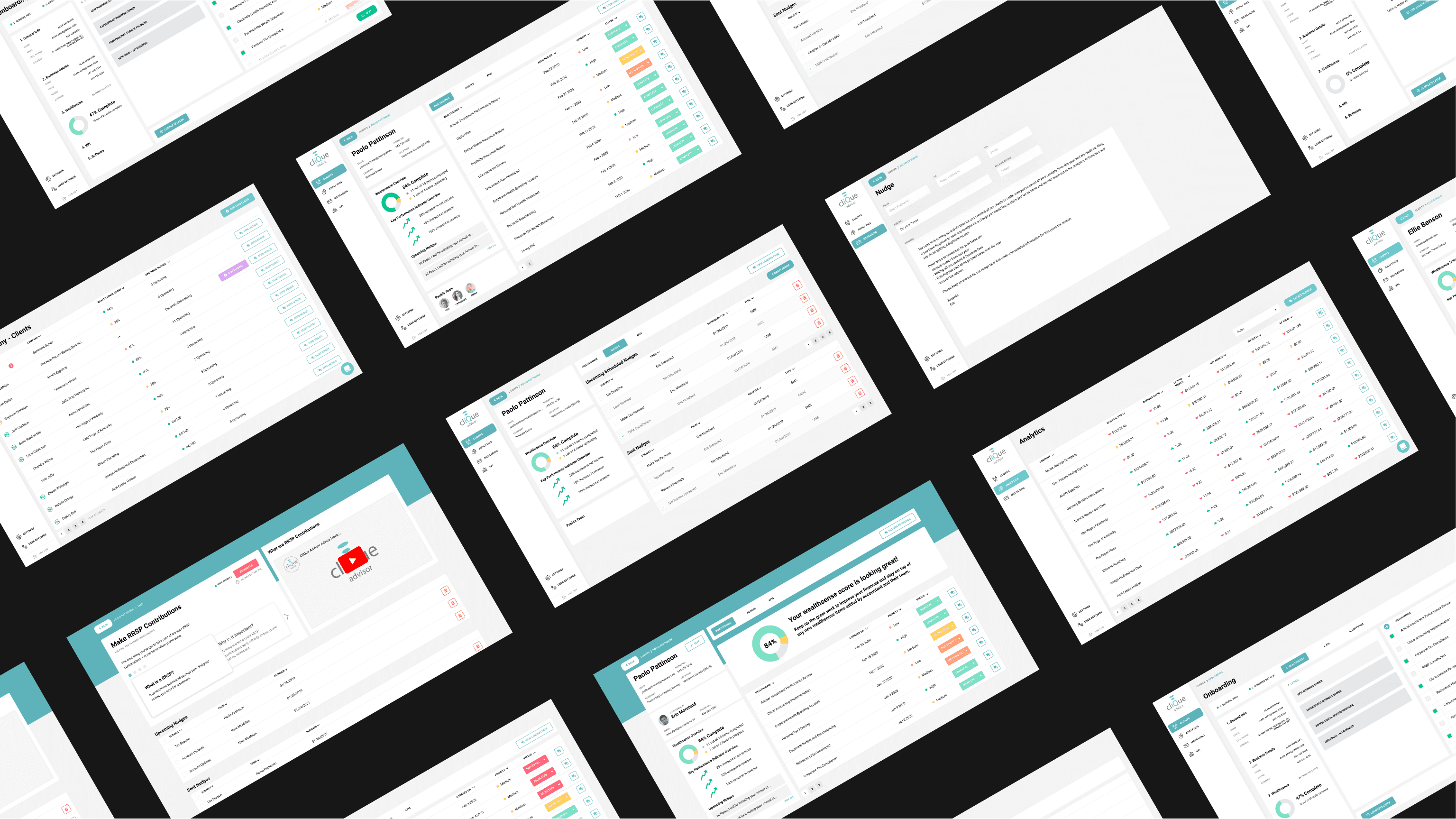
We transitioned from wireframes to a high fidelity interactive Figma prototype for user testing with three of our previous interviewees. Using a Figma prototype allowed us to share the link with remote testers, change permissions and hide it once the testing was done to maintain confidentiality. The goal of these testing sessions was to validate our solutions for the primary challenges called out in our initial interviews & research. These were improved navigation / IA, clearer presentation of information and a streamlined onboarding process.
We transitioned from wireframes to a high fidelity interactive Figma prototype for user testing with three of our previous interviewees. Using a Figma prototype allowed us to share the link with remote testers, change permissions and hide it once the testing was done to maintain confidentiality. The goal of these testing sessions was to validate our solutions for the primary challenges called out in our initial interviews & research. These were improved navigation / IA, clearer presentation of information and a streamlined onboarding process.
The feedback was overall quite positive but there was still had a lot of room for improvement in the way financial advice was being presented Our users wanted multiple avenues of learning for advice and having explainer videos or audio recordings was an item requested by multiple testers. The finalized high fidelity screens addressed the concerns I had with the original platform and in testing our users were extremely excited to see the changes they'd get to be using in the near future.
Based in Seattle, Washington with my partner and an eternally angry cat.
Copyright © 2025 Sean Fitzmartin
Based in Seattle, Washington with my partner and an eternally angry cat.
Copyright © 2025 Sean Fitzmartin
Based in Seattle, Washington with my partner and an eternally angry cat.
Copyright © 2025 Sean Fitzmartin